CAN DESIGN TRULY IMPACT HABITS BUILT OVER YEARS?

Designing AP Automation Without Disrupting What Works

UX Research & Interviews Insight Synthesis Stakeholder Alignment UX/UI Design User Studies Product Thinking Pivot Strategy & Execution
CashFlo AP Automation

Cashflo is a Finance Automation Software built for compliance, control & real EBITDA gains.
This case study focuses on one module within CashFlo - the AP Automation Layer designed to sit alongside legacy ERPs, helping finance teams reduce manual effort without disrupting systems they already trust.

Origin

Enterprise AP teams have relied on ERPs like SAP and D365 for decades. Over time, these systems became more than tools. They shaped mental models, workflows, and personal safeguards built through years of manual checks, paperwork, and lived experience.

While automation promised speed, many AP users hesitated. Not because they resisted change, but because their work carried risk. A single wrong field, missing code, or unclear mismatch could have financial consequences. Trust was built through visibility and control, not convenience.

Any system entering this space had to earn its place, not by replacing what worked, but by making it lighter to carry

Problem Solved

Instead of replacing ERPs or redesigning AP workflows from scratch, we approached the problem differently.

Cashflo's New AP Automation was designed as a layer that sits alongside existing ERPs. One that adapts to how AP teams already think, verify, and make decisions. Rather than enforcing rigid automation, the system supports judgment, highlights risk, and reduces effort where confidence already exists.

The goal wasn't a perfect system. It was a clearer, faster version of the one they already trusted

How it works

Invoices arrive by email. The system fetches them, reads them, and surfaces field-level suggestions (amount, vendor, tax codes) pulled from OCR and matched against existing PO and GRN data.

Makers review, correct, and confirm. The system flags mismatches in real time, but never overrides. Once validated, invoices move through approval and post directly into the ERP.

The workflow doesn't change. The effort required to complete it does.

CAPTURE
INFORMATION

VALIDATE WITH
CONTEXT

FASTER YET
CONFIDENT APPROVALS

My Role

I was the sole designer on this project, responsible for end-to-end UX strategy, nationwide comprehensive user research, information architecture, and the full design system built from scratch. I worked directly with the VP of Product and had close involvement with the CEO and engineering leadership throughout.

Outcomes

<1 min
Invoice booking time dropped to under 45 seconds for scanned invoices
3× faster
100 invoices processed in 1.5 hours. Previously half a day in D365
5+
Enterprise clients onboarded within 2 months of launch
0 tab switch
ERP reference data surfaced inline & users stopped leaving CashFlo mid-workflow to check D365

The Research

Why we did research

CashFlo had assumptions about what AP teams needed. So did I. Before touching Figma, both needed to be tested against people doing this work every day — not stakeholder feedback, not support tickets, but real workflows in real finance teams across the country.

The goal was specific: understand how AP teams actually move through their tools, where they slow down, where they switch to ERP mid-task, and what makes them confident enough to approve an invoice without second-guessing everything. That understanding had to come before any design decisions.

Numbers & Cohorts

16 interviews across Pune, Bangalore, Mumbai, and Delhi. Corporate offices and plant-level finance teams. Junior processors and department heads. People who'd been doing this for two years and people who'd been doing it for twenty.

Makers : Junior processors handling 300–400 invoices a day, accountable for every field they touch.

Checkers : Senior approvers validating PO-GRN-invoice matches, intolerant of noise, dependent on clear signals.

Dual-role users : Plant-level teams doing both jobs across multiple locations, bridging physical paperwork and digital systems daily.

Field research visits

"I still have to go to D365 when I forget the TDS code."

"Red is showing even when the numbers match after decimal point."

"Scanning and uploading takes too long before I can even start."

"I have to remove the pin, scan, then upload. Every single time."

"We get around 100 invoices every 2-3 days. I finish 50 a day."

"Approval should happen on the page itself. Not a pop up."

"I don't want to go back and confirm. Too many redundant clicks."

"Shipping and billing address isn't being populated. That's a pain."

"Not all invoice types are covered. That's the biggest issue."

"I still rely on D365 for due dates and vendor codes."

"I'd rate it a 3. Give us full coverage and it becomes a 5."

"Feels like data entry. Same thing every day."

"Reject and Send Back need to be clearer. I always second guess."

"Physical copies still have to be maintained alongside everything."

"For service invoices there's no GRN.
I have to enter everything manually."

"Every advance booking from a different location becomes a JV nightmare."

"I check invoice value, date, and vendor. Every time. Without exception."

"Capex invoices aren't covered at all. We still do those in D365."

"System hangs sometimes. Right in the middle of processing."

"Once I scan and send, I never know when it'll show up in CashFlo."

Insight Synthesis

Four patterns that shaped every design decision

Insight synthesis FigJam board

ERP wasn't the competition, it was the safety net.

Observation Led to Design
Users were switching to SAP mid-workflow to look up TDS codes, vendor mappings, and due dates — not because CashFlo failed, but because that context wasn't available where they needed it.
Inline ERP reference data surfaced at the exact field where it was needed.

When everything looks like an error, nothing does.

Observation Led to Design
The same red highlight was used for a decimal rounding difference and a critical tax code mismatch. Users had quietly stopped trusting the validation system entirely.
A tiered validation hierarchy — critical flags prominent, advisory flags visually subordinate.

The manual re-check wasn't a habit to break. It was accountability in action.

Observation Led to Design
Every user verified the same three fields on every invoice regardless of what the system showed. Personal financial consequence made this non-negotiable.
Designing to make verification faster and more confident but not designing it away.

The physical world hadn't gone away. The product pretended it had.

Observation Led to Design
Invoices were still being manually unpinned, scanned, and emailed before they entered the system. A constant gap between what was in hand and what was on screen.
Acknowledging this as a hard constraint — and designing every downstream interaction to compensate for the uncertainty it created.

The Design

Entering the System

The first screen a new user sees is a login — simple, expected. What's less expected is that validation happens inline, as you type. Requirements confirm green one by one before you submit. In a product where users are already anxious about doing things correctly, removing even this small moment of uncertainty matters.

The Listing Page
Every Maker starts their day here. What could easily have been a raw list of 267 invoices becomes something more useful: a pre-triaged queue.

The Difficulty column (All Good or Problematic) is the system's first gift to the user. Before opening a single invoice, they already know which ones will go smoothly and which ones need attention. This wasn't a feature request. It came directly from watching users scan their physical invoice stacks every morning, pulling out the ones they knew would cause problems.

Entering the system step 1
Entering the system step 2
Entering the system step 3

Invoice Booking Page

The invoice PDF lives on the left. The form lives on the right. They never separate.

This was the single most important layout decision in the product. Every user we interviewed was cross-referencing the physical invoice against what they were entering by switching tabs, printing, or keeping a paper copy beside the screen. We removed that context switch entirely.

The right side follows a single column layout deliberately. Each field has room to surface contextual guidance exactly when the user is on it, not all at once. Users aren't confronted with everything upfront.

And for users who prefer working from a physical copy in hand, the left invoice section collapses. The form expands full width. Same workflow, different working style — because the product adapts rather than prescribes.

(First Fold)

(Second Fold)

Contextual Validation field by field

When a user lands on a field, the corresponding detail in the PDF highlights. No hunting, no cross-referencing. The document and the form are in conversation.

To the right of each field, the system responds in real time. A green confirmation if everything matches, a specific flag if something's off, nothing if it's still waiting. Contextual, not overwhelming.

Worth noting: The PDF highlighting required convincing engineering to map OCR coordinates to specific fields — a non-trivial technical ask. Accuracy wasn't perfect at launch, but the interaction principle was sound and users responded well to even a partial implementation. Sometimes the right idea ships imperfectly before it ships well.

Intelligent Suggestions

Every suggestion in the system was designed around one question: does this save the user a decision, or create one? The threshold was specific — useful enough that users wouldn't need to open SAP, never so much that opening SAP felt easier.

Line Item Table
Line items from the PO and GRN are surfaced directly in the table so that users pick rather than type. Columns configurable per user so only what's relevant shows up.

Rate conflict
OCR and e-invoice values shown side by side, tagged by source. One click to resolve.

GRN & PO matching
Auto-matched chips in the field. Alternatives present, never competing.

GRN Search
Type to search — results show GRN, PO, and invoice number together. Three-way matching in one interaction.

GRN matching chips Rate conflict tooltip Line item table GRN search

Three way PO Matching

In every research visit, we watched users underline numbers with a pen when something didn't add up. That's where the red underline in this screen comes from — not a design convention, a direct translation of how these users already mark errors on paper.

PO, GRN, and invoice quantities and rates sit side by side in one table. Discrepancies are underlined. Deltas shown to the right. Status per line item — Match, No match, PO GRN Mismatch — scannable in seconds without mental arithmetic.

Three-way PO matching table

Approvers View

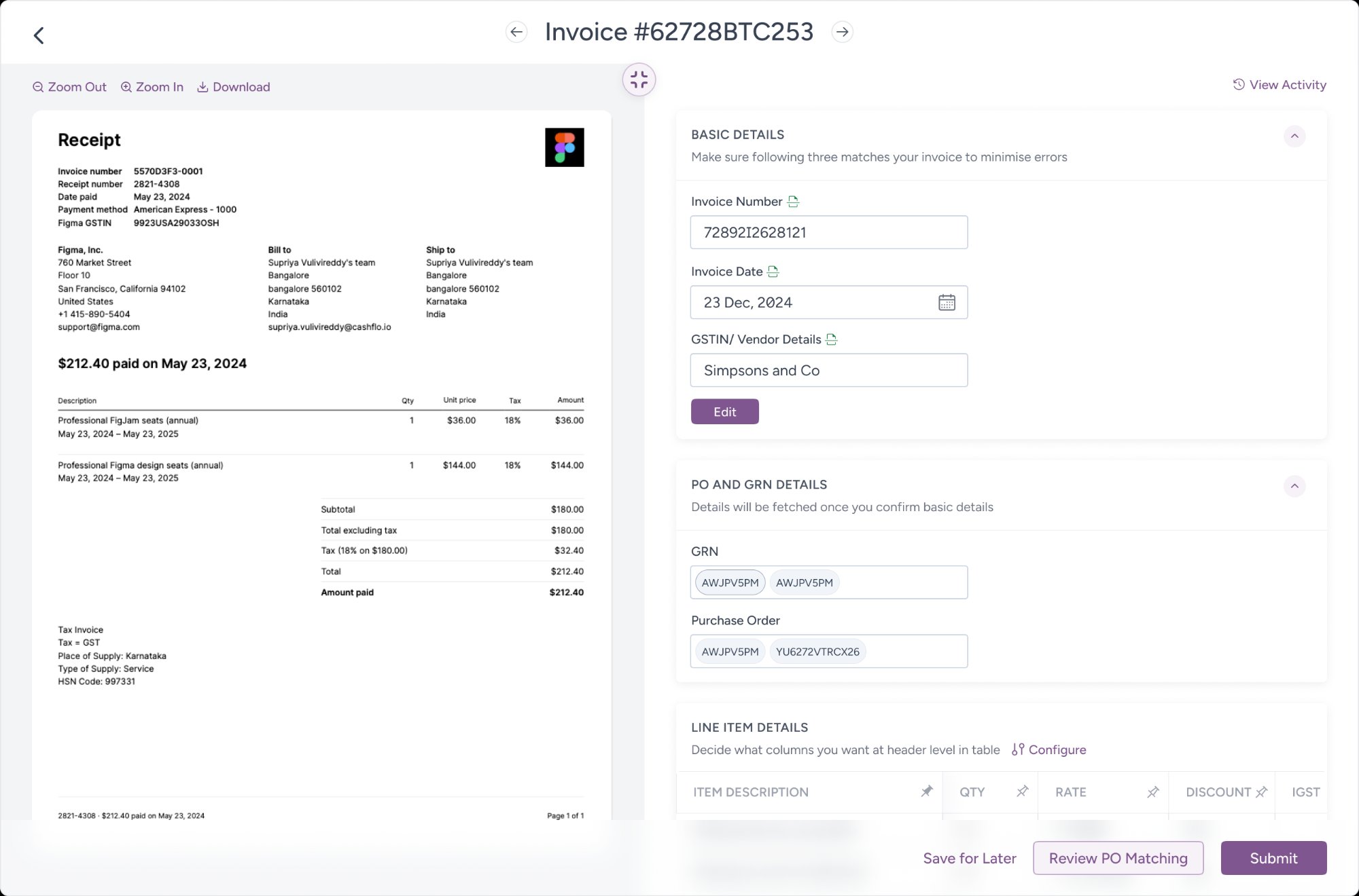
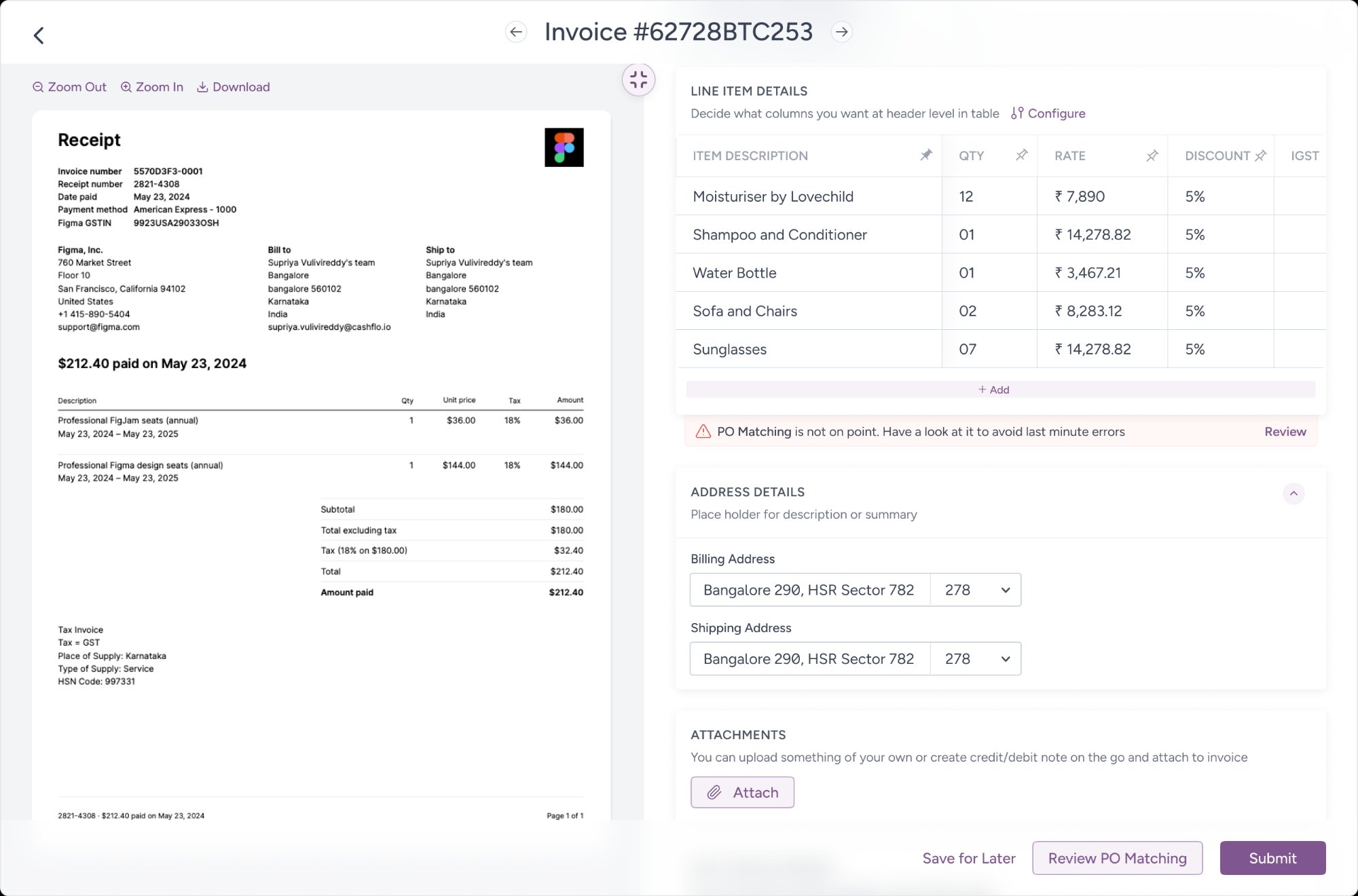
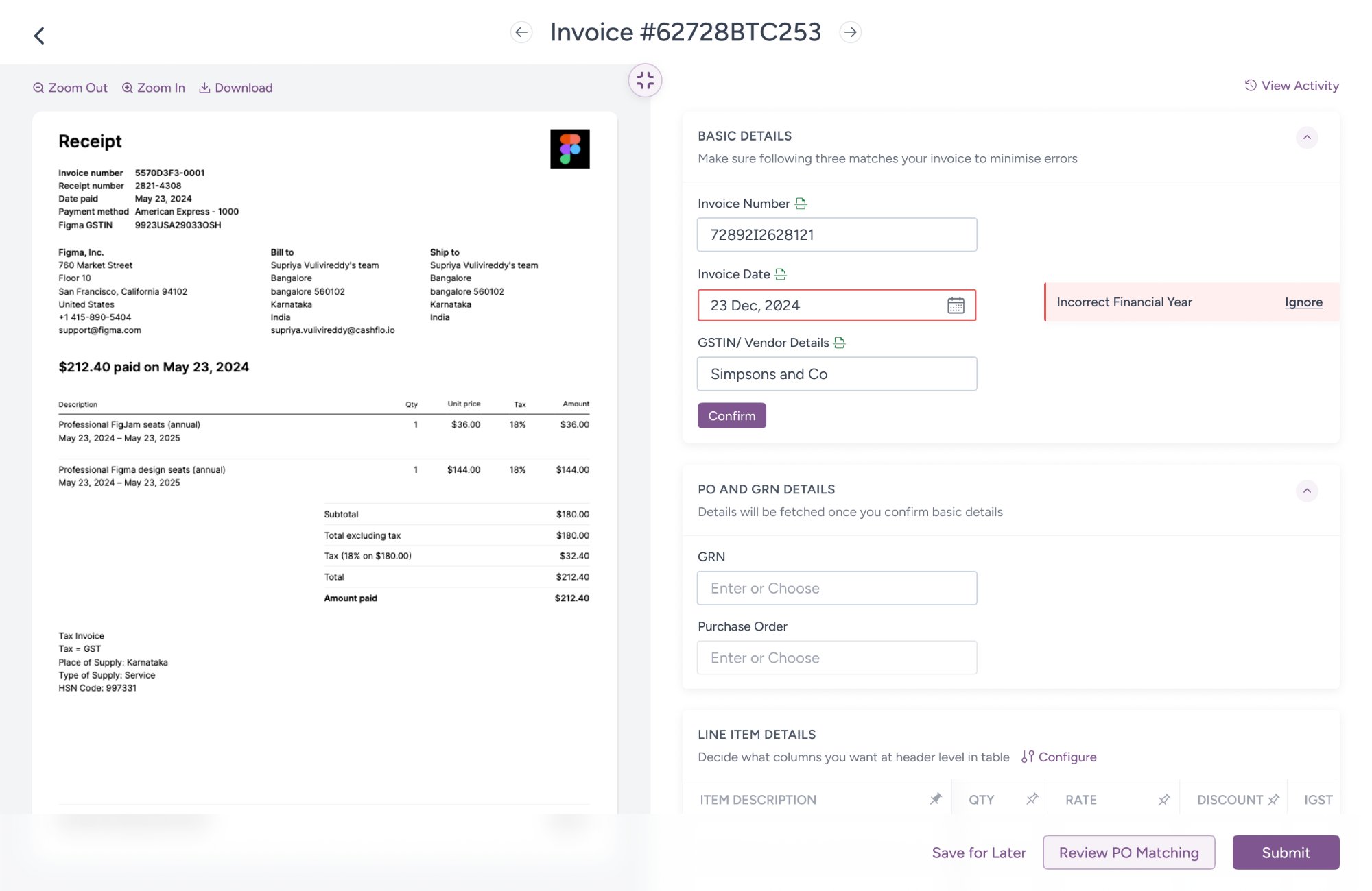
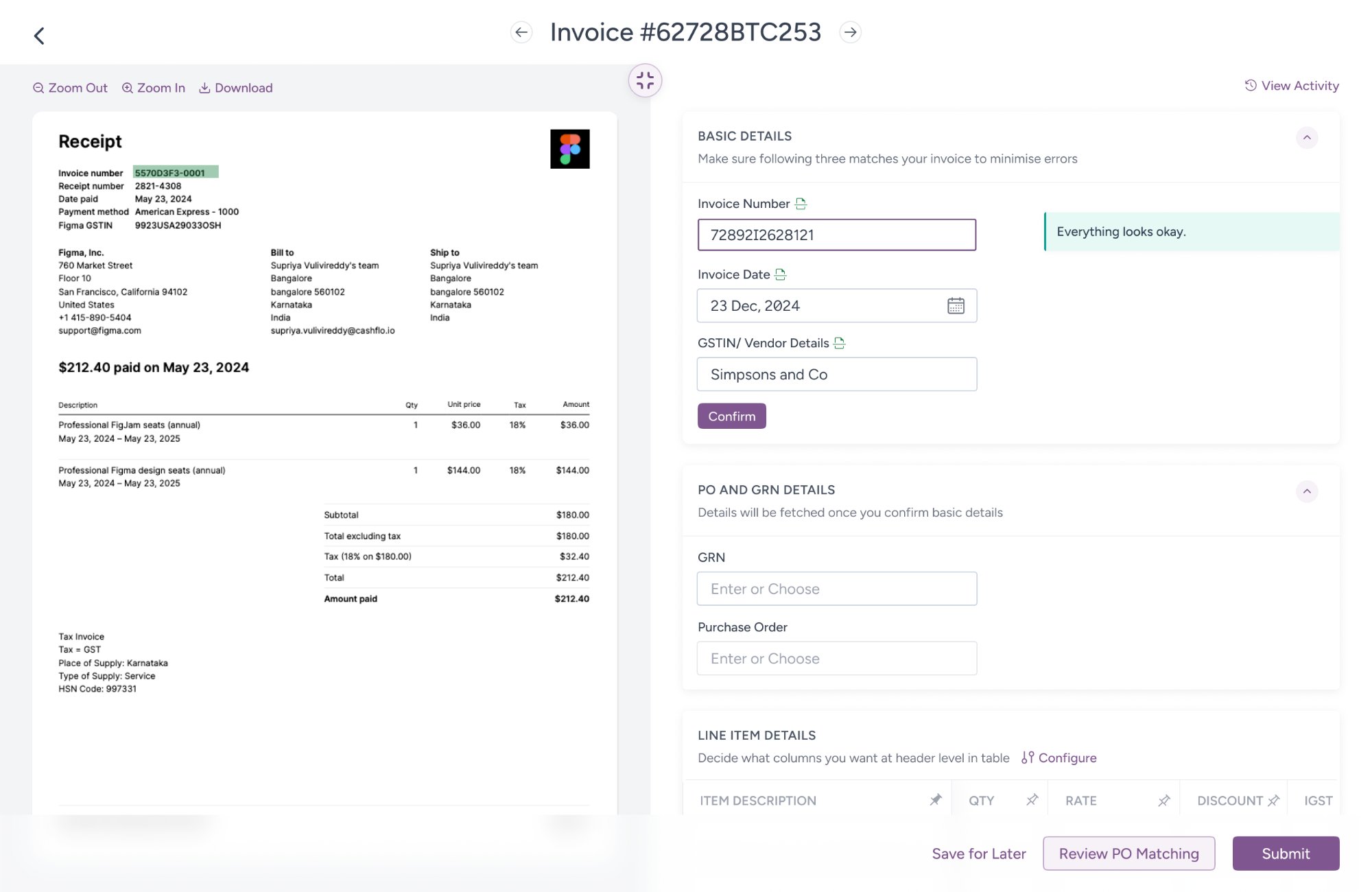
Same product, different mental model. The Maker processes. The Approver judges.

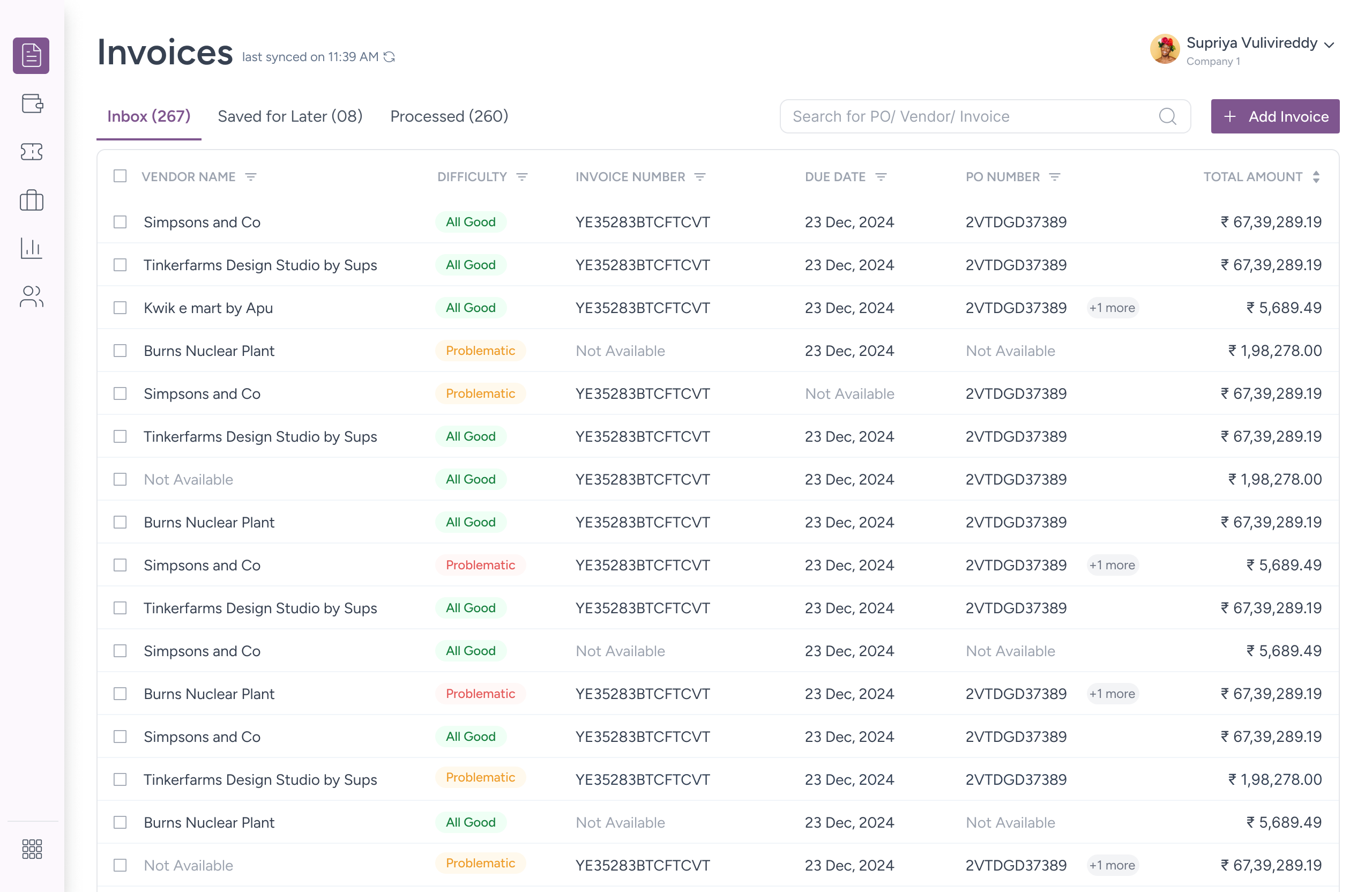
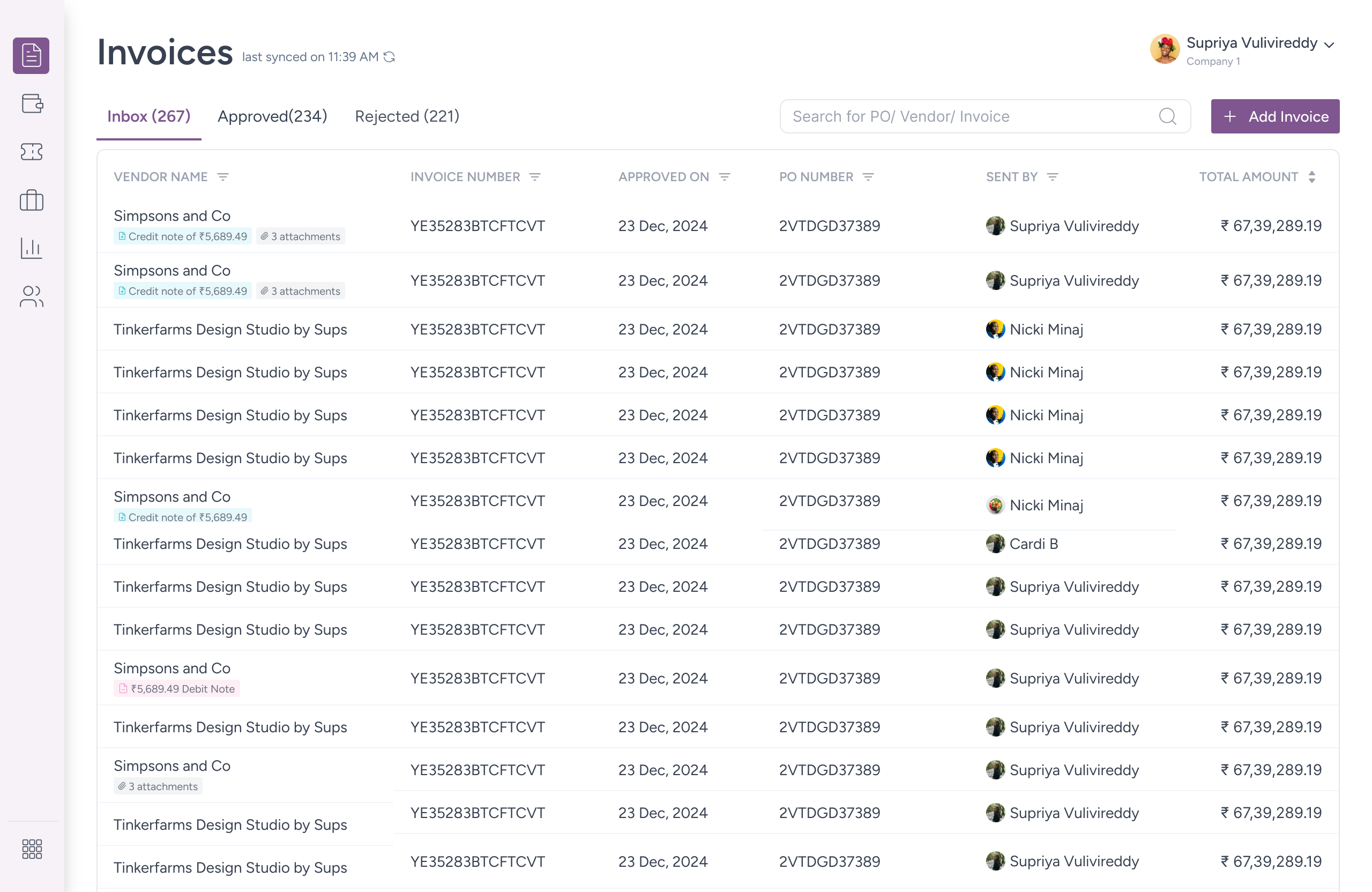
The listing page reflects this immediately — no Difficulty column, no triaging needed. Instead: who sent it, when it was approved, credit notes and debit notes surfaced inline beneath the vendor name. The Approver arrives already knowing the context around each invoice, not just the invoice itself.

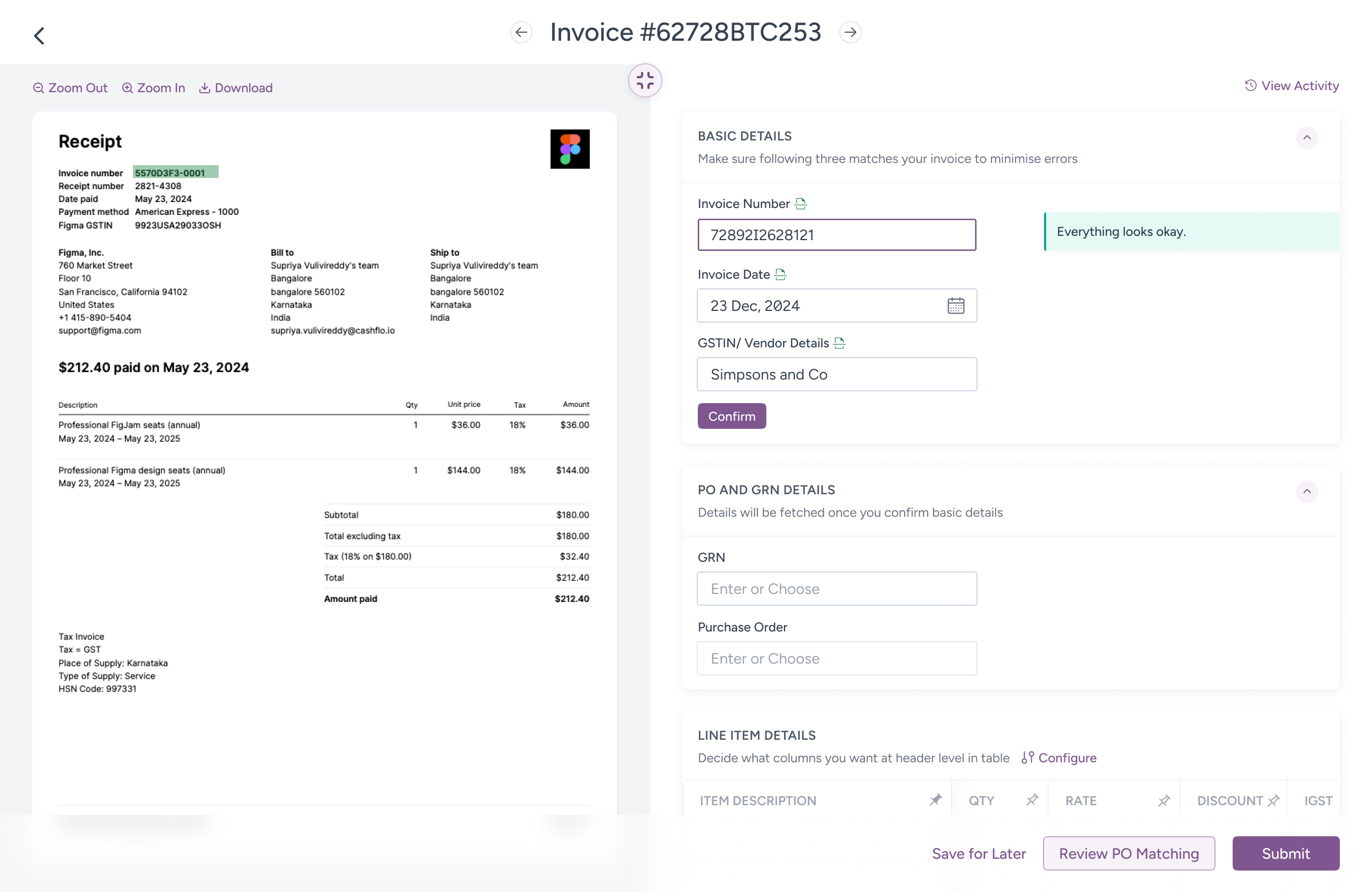
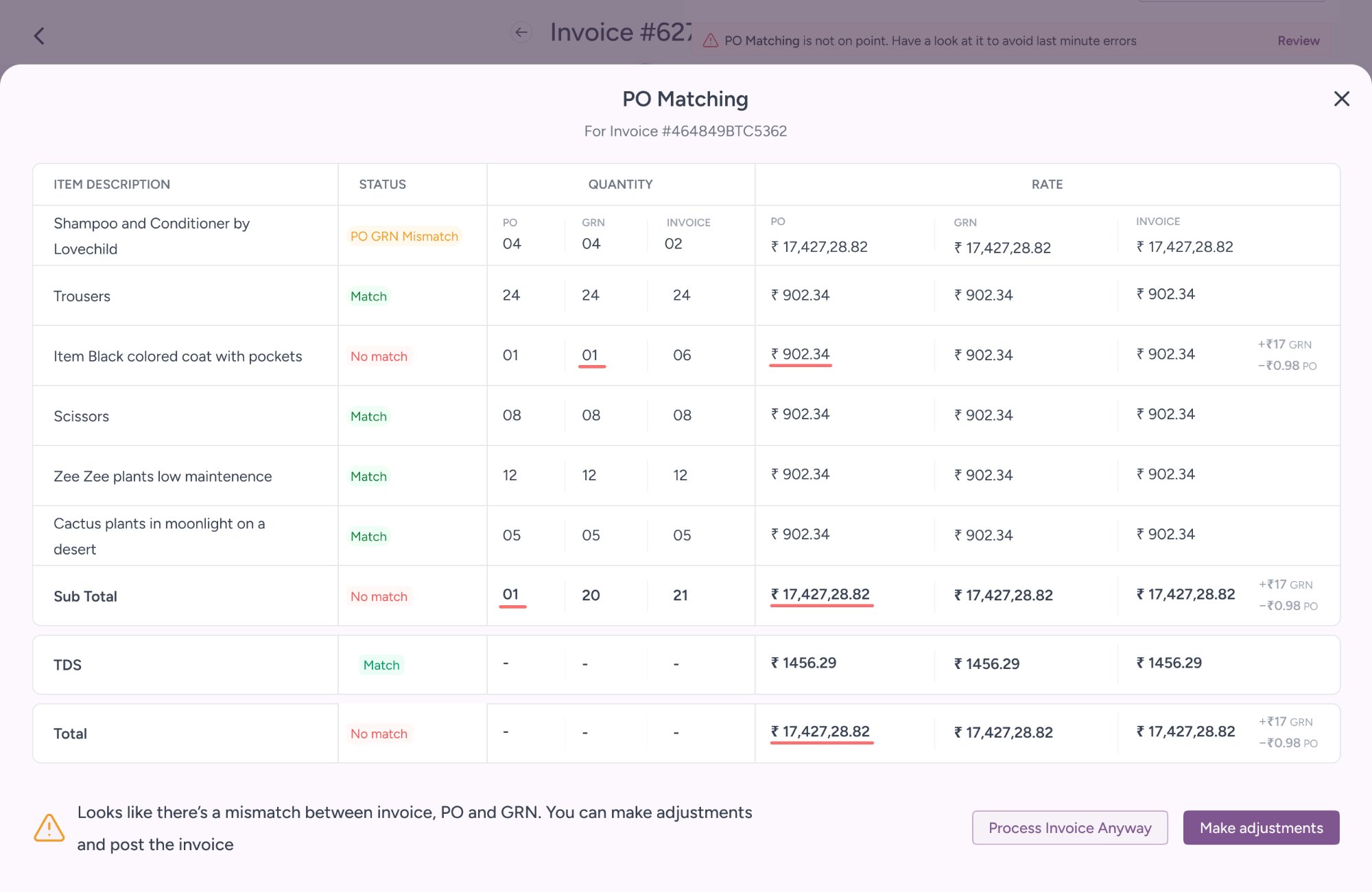
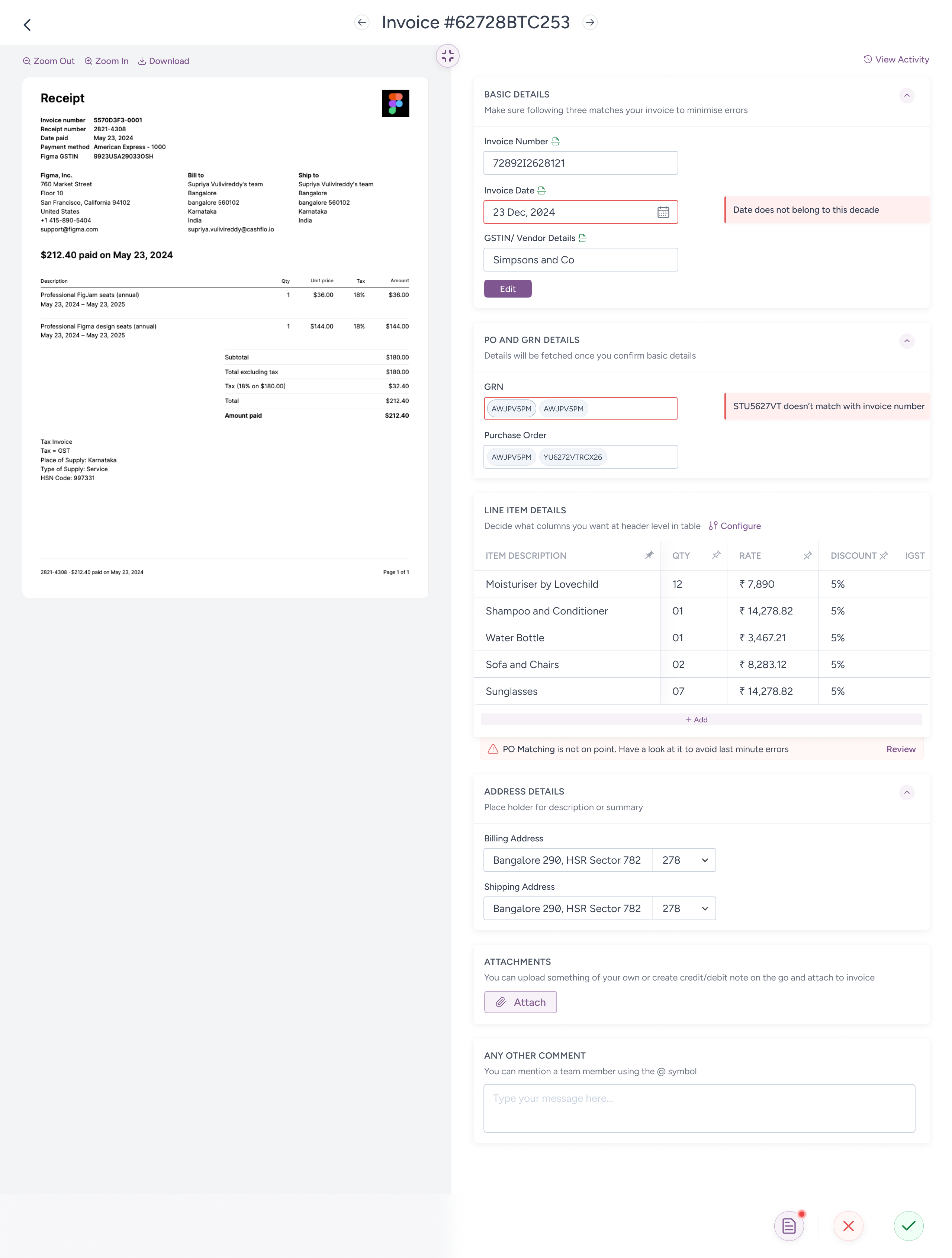
Errors surface upfront rather than at field level — a deliberate reversal. By the time an invoice reaches a Checker, the Maker has already been through it. What the Approver needs isn't field-by-field guidance, it's a fast read on what went wrong and where. The same split layout is retained: plant-level teams often play both roles, and an unfamiliar layout on the same platform would create an unearned learning curve.

Three actions at the bottom — Accept, Reject, Send it Back. Because "this is wrong, stop it" and "this is wrong, fix it" are different decisions that deserve different buttons.

Approver view — approved state
Approver view — full listing

Action Bar at Bottom

Every action lives in the footer — no navigating away, no losing context. The banner shifts state depending on where the invoice stands.

Three unresolved issues? The system tells you before you submit, with a direct path to PO Matching. Everything clean? It says so plainly and gets out of the way. Sending back? You pick the person directly from the banner. Rejecting? One confirmation that also tells you the consequence — the invoice stays on the feed permanently.

The user never has to go back to the listing page to take the next action. Forward only.

See it all together

What you're about to watch covers the core of the AP flow — invoice listing, booking, validation, PO matching, and approval. The product itself extended well beyond this: GRN management, PO tracking, vendor portal, bulk processing. But these screens are where the hardest design problems lived, and where the research had the most to say.

The Impact

6 enterprise clients onboarded within 2 months of launch

Not pilots. Not trials. Live, processing invoices daily

"Feels like a modern tool."

"Same job but not tiring"

"Everything is so fast."

What I'd do differently

Twelve weeks is enough time to ship. It's not always enough time to be right. Some decisions that deserved a second round of testing went straight to build. Not because we skipped research, but because the timeline didn't leave room to act on what we found.

A significant amount of time went into explaining interactions to the front end team through prototypes and walkthroughs. In hindsight, that's exactly the kind of work AI tools could handle today. What took days of back and forth could now be a prompt and a working component.

The design system documentation proved its worth in a way I didn't fully anticipate. Because every component was documented thoroughly, the front end team built consistently without needing constant design oversight. The cohesion in the final product came directly from that groundwork.

The PDF field highlighting was the right idea shipped imperfectly. OCR coordinate mapping is harder than it looks, and accuracy wasn't perfect at launch. The interaction principle was sound. The execution needed more time than we had.

Users wanted fuller ERP coverage before they'd call it a complete replacement. A 3.5/5 is honest feedback. It means the core works but the edges still send people back to SAP.

The physical-to-digital gap — scanning, uploading, emailing — was never solved. We designed around it. That's not the same thing

Everything we design adds force to the world. The question is not whether it moves something. The question is in which direction.