What separates a transaction from a gesture?


Mudrex is one of India's leading crypto investment platforms with 2M+ users and 400K monthly active investors, built around a simple idea: that the complexity behind crypto should not be the investor's problem. The platform serves a broad range of users, with a strong focus on retail investors who are used to straightforward, predictable investment products.
The product team saw gifting as a growth lever: bring in new users through existing ones, give the marketing team a mechanism for seasonal campaigns, and create a reason for people to talk about Mudrex outside the investing context.
Digital gifting as a category was growing 20% year over year in India. The opportunity was clear. What was missing was a crypto-native experience that did not feel like an afterthought.
Lead Product Designer. End-to-end ownership from framework through visual execution, including the physical gift card exploration. Worked alongside product management and marketing teams in a focused 1.5-week sprint driven by a fixed marketing campaign deadline.
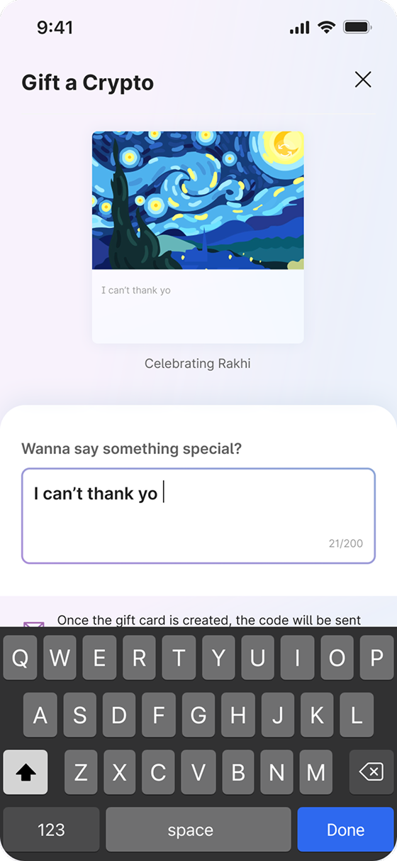
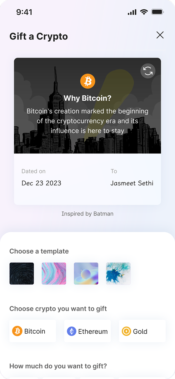
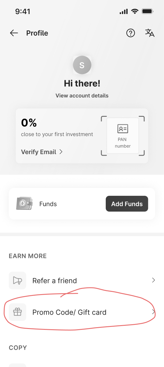
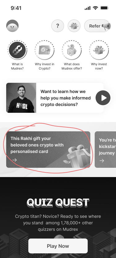
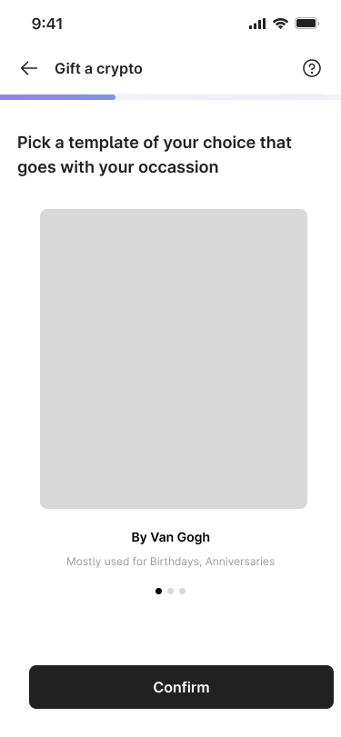
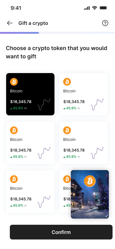
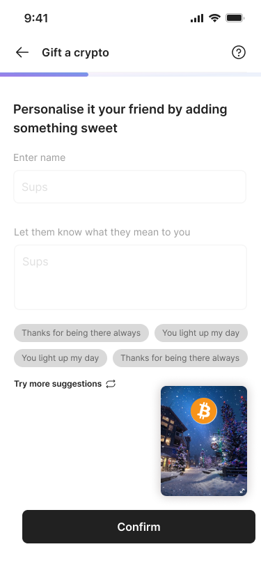
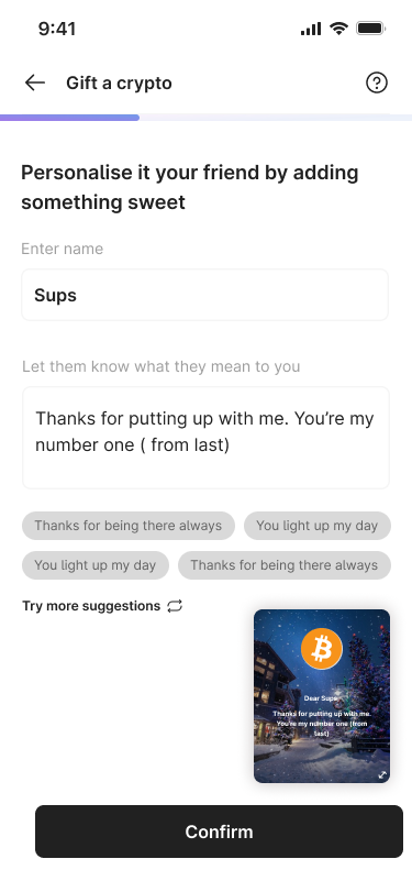
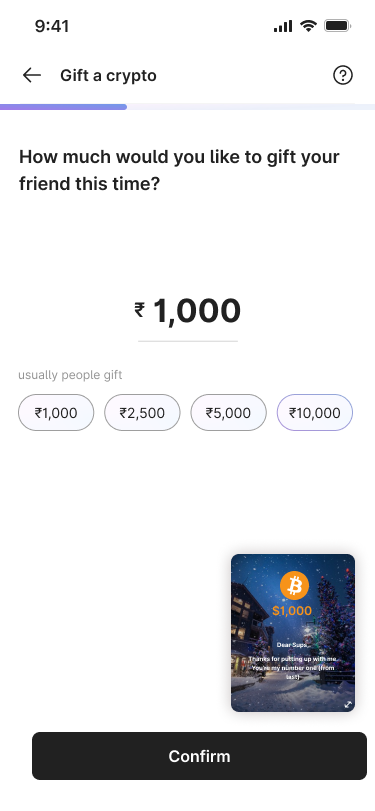
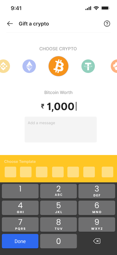
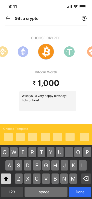
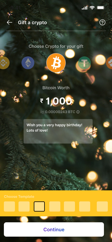
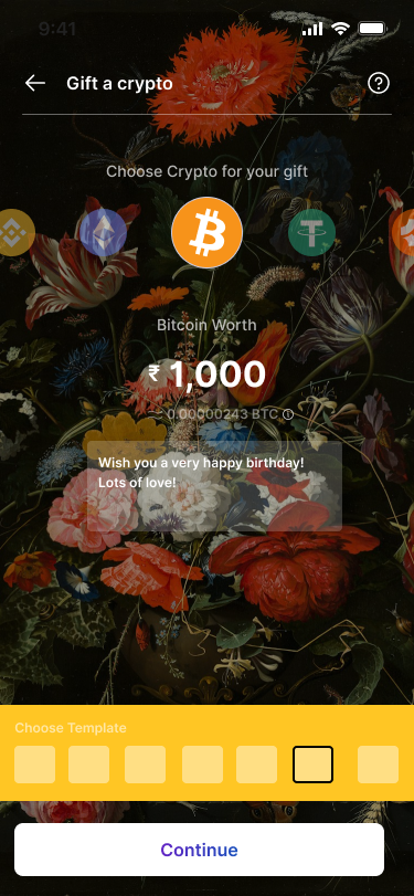
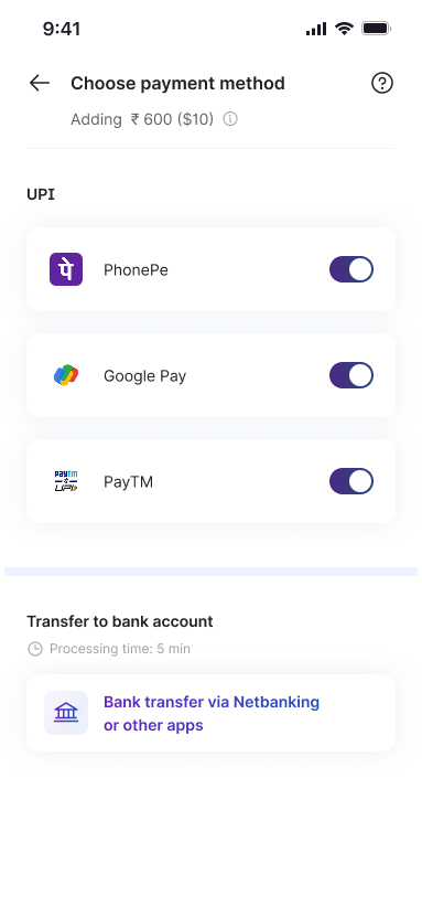
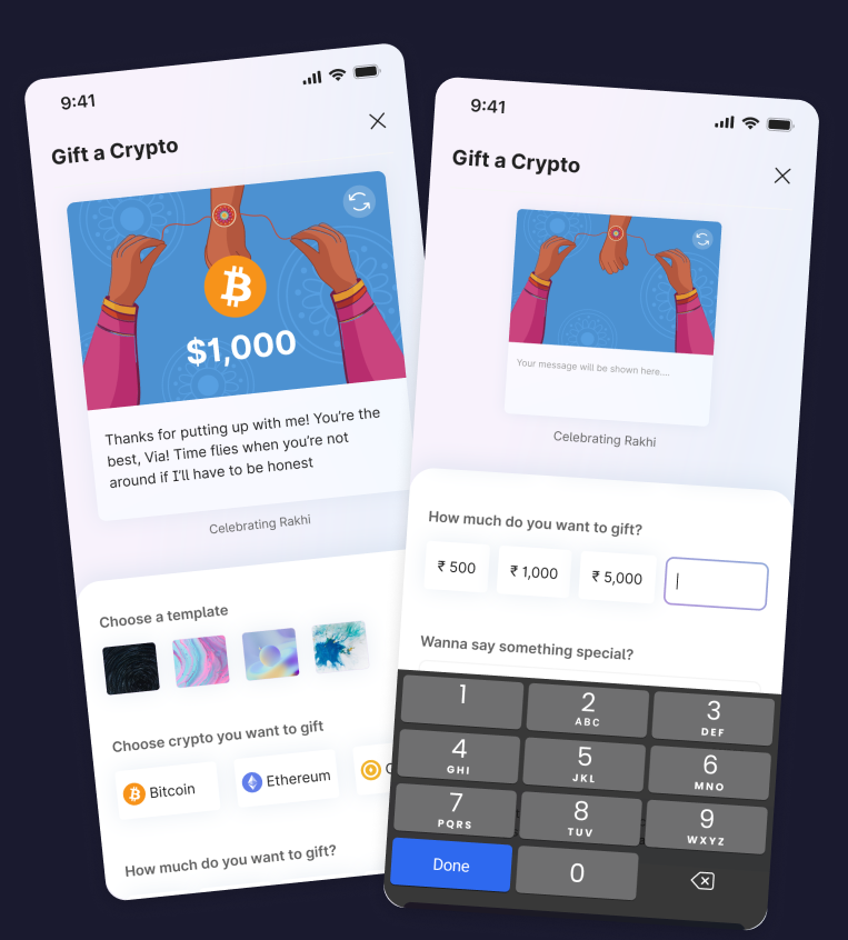
The product requirement described a transactional feature: select a token, pick an amount, send it to someone. Functionally, every gifting product on the market already does this. Amazon, Google Pay, Nykaa, Myntra. They all let you send a gift card. And they all feel exactly the same.
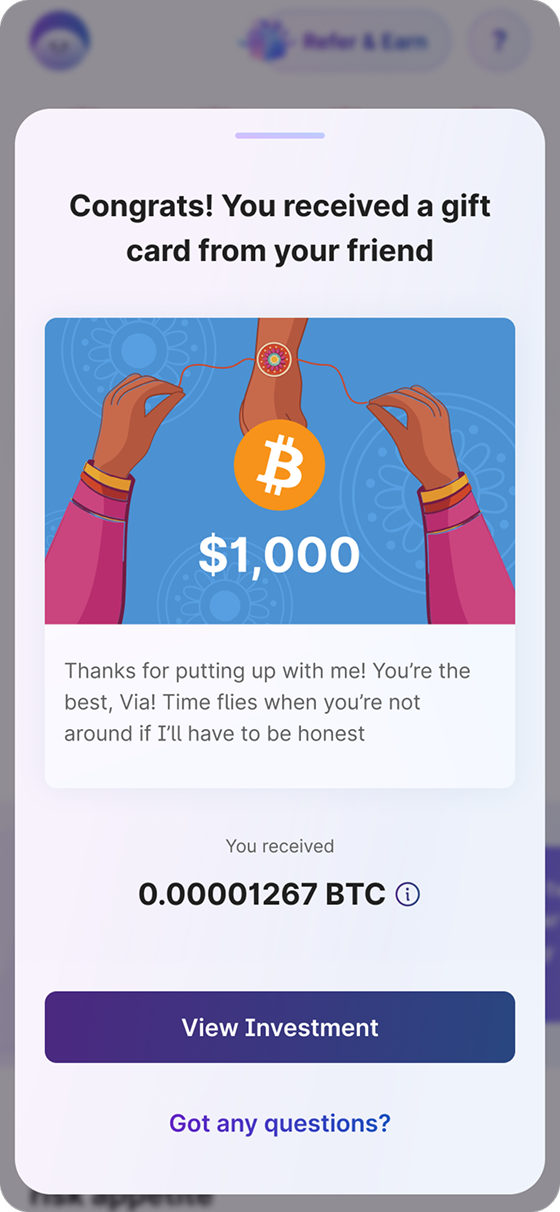
That sameness is the problem. When you receive a digital gift card, what do you feel? At best, a mild acknowledgement. At worst, the sense that someone checked a box. There is no weight to it. No evidence that the person who sent it spent any time thinking about you. The transaction is complete, but the gesture is empty.
When I spoke to colleagues across the office, people who regularly give and receive gift cards on other platforms, the same sentiment kept surfacing: they would not mind using gift cards more often if they stopped feeling like an obligation rather than a thoughtful gift.
I have sent so many gift cards but honestly, it always feels like I am taking a shortcut. Like I could not be bothered to pick something real.
When I get a gift card, I use it. But I do not remember it. There is nothing to remember. It is just money with a theme on it.
I would use gift cards way more if they did not feel like an obligation. Like, if it actually felt like someone put thought into it? That would change everything.
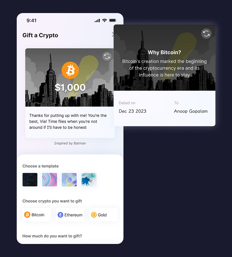
It is the wrapper and the note that makes a gift feel real. Not the thing inside. Digital gift cards skip all of that.
The oldest design problem: we digitise the mechanics and lose the meaning.
Before designing any screens, I mapped out the complete journey for both existing and new users, tracking what they think and feel at every stage. This was not a standard user flow. It was an emotional journey map that would guide every design decision that followed.
With a marketing campaign deadline driving the timeline, shipping everything at once was not an option. So the work was structured in three deliberate passes. Each one building on the trust and buy-in earned by the previous one.
Iteration 1
Get the bones right
The first pass was about getting the information architecture right. Where does a user first encounter the gifting option? What are the entry points across the app? And once they are in the flow, what is the minimum viable path from selecting a token to sending it? These wireframes covered the structure, not the emotion. The goal was to prove the feature works before arguing for what would make it feel special.
Entry points to introduce Gift a Crypto
Iteration 2
Make the case for richness
With the foundation proven, I went back to the same screens and layered in the elements that would elevate the experience. Live preview so users see their gift take shape as they build it. Personalised templates with meaning. The ability to add a message that feels written, not typed. This pass was about showing stakeholders what the feature could become, and making the case that the emotional layer was worth the engineering cost.
Gifting flow with personalisation elements
Iteration 3
Bring it together
With buy-in secured, the third iteration unified everything into one cohesive wireframe set. The non-linear layout where users see their card come alive as they make choices. The flip interaction, the adaptive preview, the gift-wrapping moment. Every element from the first two passes now worked as a single, continuous experience. Still wireframes at this stage, but the thinking was complete.
Unified gifting experience
See it take shape as you design it
Most gift card builders show a static preview at the end. Ours updates in real time. As the sender picks a template, writes a note, or adjusts the amount, the card transforms with them. Sending stops feeling like a form and starts feeling like creating.
Templates with a bit of your personality
Generic holiday graphics make every gift card look the same. We designed templates tied to real occasions and emotions: Diwali, birthdays, thank-yous, just-because. Each one feels like a choice the sender made, not a default the system picked.
The thought behind the gift
A physical card has two sides. The front is what everyone sees. The back holds the personal note. We brought that into the digital card with a flip interaction. Tap to turn it over, and the sender's message is waiting on the other side.
The unwrapping moment
Nobody remembers opening a notification. But everyone remembers tearing wrapping paper. We added a gift-wrapping animation that plays before the card is revealed. A small moment of theatre that turns a screen into an experience.
The gifting experience did not have to end at the screen. If the goal was to make a digital gift feel as real as a physical one, why not explore what happens when it actually becomes physical? This was not part of the original brief. It came from a conversation with stakeholders after the digital experience was locked.
Physical gift card explorations across three directions: premium minimal, artsy expressive, and crypto-centric.
The card had to feel worth keeping. Thick card stock, embossing, and metallic edges on plastic to mimic the weight of metal.
Opening the packaging had to feel like an event, not an afterthought. The unboxing moment mattered as much as the card itself.
Each direction explored a different relationship between the brand and the occasion. Premium for corporate gifting, artsy for personal moments, crypto-centric for enthusiasts.
This was a first for Mudrex: extending a digital product into something tangible. It proved the design thesis that if you design a gift worth giving, people want to hold it.
On Constraints:
A 1.5-week deadline forced clarity. There was no room for ambiguity about what mattered. The tight sprint made me structure the work in layers, and that structure turned out to be the strategy. Each pass earned the right to the next one. Without the constraint, the work might have been broader but not sharper.
On Stakeholders:
The emotional layer was not a given. It was a case I had to build. Stakeholders saw a gifting feature. I saw an opportunity to design for feeling. Showing the functional version first built credibility. Then when I proposed live preview, personalised templates, and the unwrapping animation, the argument landed because the foundation was already proven.
On Designing for Emotion:
Emotion in fintech is not decoration. It is differentiation. In a space where every product looks and works the same, the feeling is the only thing that separates you. Users did not remember the flow. They remembered that it felt special. That is what turned receivers into senders and senders into advocates.