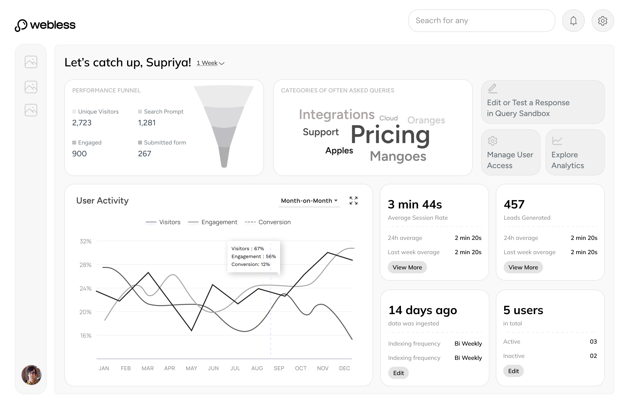
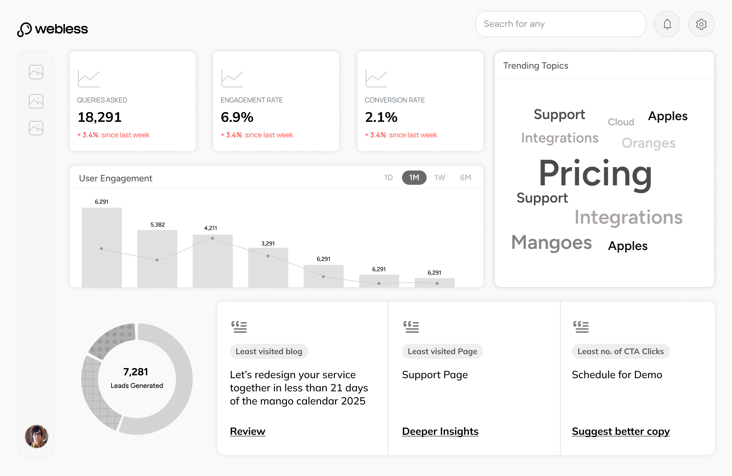
Every website has answers. None of them know how to give one.
A user looks for an answer.
The website gives them pages.
58.5%
of searches end with zero clicks
SparkToro, 2024
1.1%
average B2B SaaS website conversion
Electroiq, 2024
2.5B
daily queries now go to AI, not websites
OpenAI, 2025
A user lands on an enterprise website with one specific question. They find the search bar, type it in, and wait. The spinner starts turning.
47 seconds about to be wastedResults load. A blog post. A whitepaper. A case study from 2021. A "Contact Sales" page. Not one of them answers the question. The user scans the list, confused.
They click the most promising result. Scroll. Read. Wrong page. Hit back. Try another. The answer exists on this website. They cannot reach it.
Still no answerFrustration peaks. The user stops trying. A new tab opens. ChatGPT. Perplexity. Claude. Same question, different surface.
The website just lost themThey type the exact same query into an AI assistant. The typing indicator appears. Two seconds. Not forty-seven.
A clear, direct answer appears. They feel satisfied, close the tab. The enterprise never knew they were there. That question was theirs to answer. Someone else answered it.
User satisfied. Website never knew.AI Assistant
Thinking...
AI Assistant
Answer ready
Enterprise plans start at $2,000/month, scaling with query volume. Includes dedicated onboarding, SLA support, and custom integrations. Free 14-day trial — no card required.
The problem, stated plainly.
What Webless does
Webless embeds AI-powered search directly onto enterprise websites. A user types a question and gets a direct answer pulled from the company's own content using RAG and vector embeddings, delivered in seconds. No redirects. No page hunting. No dead ends.
The product sits in the MarTech and GTM stack. Its buyers are Growth and Demand Gen leaders at B2B companies whose websites carry years of content that users cannot find.
The answer was always there. Webless makes sure the user finds it before they leave.
My Role
Sole designer across two parallel workstreams over six months: the end-user search and answer experience embedded on client websites, and the client-facing admin panel that gave enterprise teams visibility and control over the product.
Partnered directly with the founder and frontend team. Ran usability studies, shaped product prioritisation, and owned the design decisions end to end, from which tools to build first to how each one shipped.
Outcomes
140%
Search discoverability increased across redesigned deployments
43%
Users who asked one question came back to ask a second
43s
Average session time for users who engaged with search
3X
Client onboarding speed improved after component system was built
PART I
The Search
Visible enough for users to catch attention
without demanding it
Restrained enough for clients to live on an enterprise website without a fight
Visible enough to earn user attention.
Restrained enough to clear client approval.
Six concepts explored
Concept 01
Concept 02
Concept 03
Concept 04
Concept 05
Concept 06
Four of five clients came back below 2%. The variation was not random. It revealed which design variables mattered most.
Client D's rate was 3x higher, driven by placement, faster load time, and intent-driven users. That gap became the question worth answering.
Chandhana, 25
Website Designer
Mistook the bottom bar for a cookie consent modal. Ignored it entirely until a different element caught her attention.
Oh, another one of those cookie things at the bottom. I never read those—they're always the same.
Visibility gapArunava, 28
Software Professional
"Ask Anything" — but ask what, exactly? No context for what the search could or should handle.
Ask anything... okay, but like, anything about what? Can I ask about pricing? Features? I don't know what's in scope here.
Label mismatchShubhang, 29
Product Professional
Found search only after dismissing a cookie popup that had been blocking it the entire time. Reacted with an "aaahhh."
Wait, that was there the whole time? Aaahhh! I kept looking for a search icon in the nav. The popup was blocking it!
Discoverability gapAnoop, 28
General User
Went straight to the top nav. Expected search to live there. Never looked below the fold.
Where's the search? Usually it's up here... top right corner. That's where every website puts it. I didn't even scroll down.
Mental model mismatchRotating questions
Users did not notice the rotation happening
Type-in animation
Motion catches peripheral attention without asking
No top nav icon
Removed to reduce client approval friction in V1
Search icon in top nav
Users look here first. Meet them where the mental model is.
Static prompt bar
Nothing signalled the bar was interactive
Visual microanimations
Signals interactivity before the user acts
No clear button
Basic input state only
Clear button + UX hygiene
Reduces friction once the user is inside the interaction
None of these were radical redesigns. They were corrections — each one tracing back to something a real user showed us. The version that moved the numbers was quieter, not louder.
Search discoverability increased across redesigned deployments
Users who asked one question came back to ask a second
Getting a user to ask a question was only half the problem. What happened next had to make them trust the answer. The lightbox had to do four things at once: deliver a concise response, show the depth behind it, avoid feeling empty on first load, and give the user a reason to keep going.
Nine directions explored. Each one testing a different balance between those four. The same answer content sits inside every layout — what changes is the structure around it.
The admin panel gave enterprise clients direct ownership. Three tools, built in the order clients needed them.
|
|
Prove the product is working |
How many users are engaging with search?
What questions are users asking most?
Which content is driving the most answers?
Is search performance improving over time?
|
Analytics Turns search activity into evidence - the data clients needed to justify Webless before every renewal. |
|||
Trust what goes live on their website |
Webless auto-classifies content - but is every page correct?
Some pages should never surface in search results
Classifications need human sign-off before going live
Edits and overrides need to be tracked, not lost
|
Content Manager AI proposes. Clients approve, edit, or exclude. Nothing goes live without their say. |
||||
Own the answers their users receive |
What are users actually asking on my site right now?
Some AI responses are incomplete or off-brand
Critical queries need guaranteed, hard-coded answers
The AI needs to learn what it does not know yet
|
Query Sandbox Real queries, visible for the first time. Clients edit, override, or teach the AI - on their terms. |
The first tool built. Without visibility into search performance, clients had no way to see value - and the commercial argument collapsed before it could be made.
Real queries, real responses, visible for the first time. And for the first time, editable. The sandbox gave clients full editorial control over every element of the AI answer state - the response, the CTA, the content tiles, the related questions.
800 pages, ingested automatically. The hard part was not indexing them - it was giving clients the confidence that the right ones were included, the wrong ones were excluded, and nothing had gone live without their review.
Execution Handbook
When you are trying to convince clients that an AI tool is worth betting on, the product has to feel serious. Not just functional but considered, down to every detail. I mapped each component to its smallest moving part, defined exactly what a client could change and what we would never compromise on, then sat with the engineers until it shipped. A client could see Webless on their site and believe it belonged there.
No single decision produced these. Each number traces back to a specific constraint taken seriously.
4to12+
Clients in 6 months
Faster onboarding and a product that could absorb any client's brand meant the commercial pipeline moved significantly faster.
85%
Discoverability increase
Experimenting with placement of the search bar, micro-animations, and intriguing rotating starter questions brought significantly more users to the search entry point.
46%
Asked a second question
Suggested questions were purely contextual — generated from what the user just asked, not generic prompts. The answer state earned the next question.
43s
Avg. session with search
Sessions that included search lasted significantly longer. Users were reading, not bouncing.
Signals
Surfaced by usage
Usage revealed chatbot flows, gated content, and form filling as new product directions.